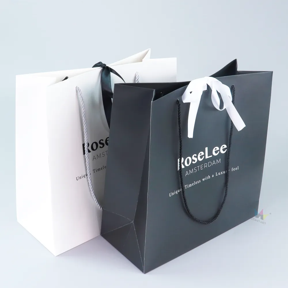
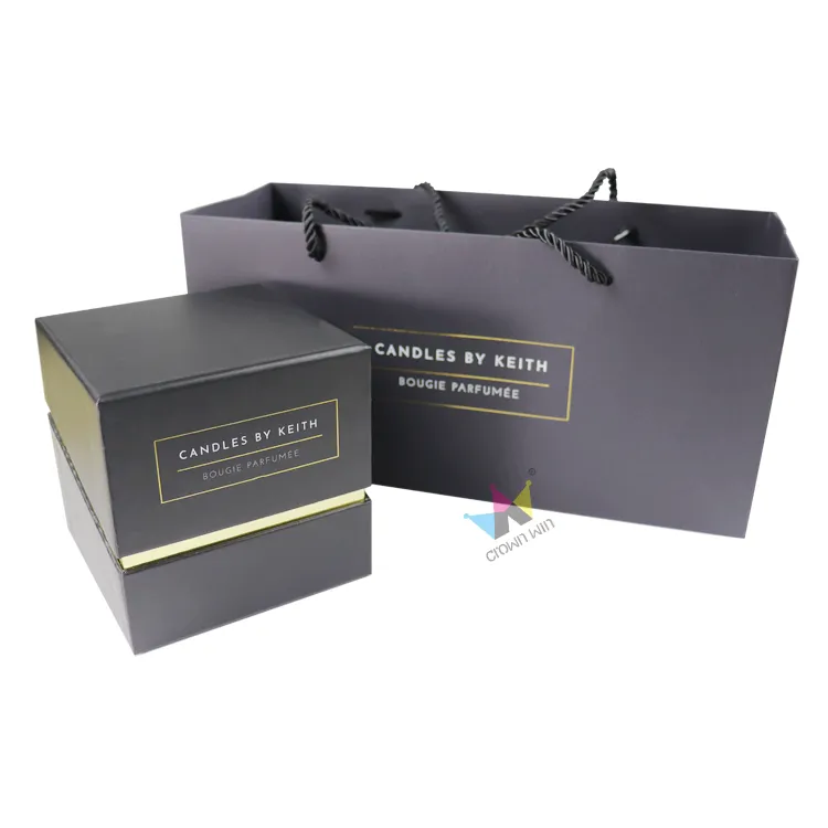
Bold, trendy colors can easily become dated and clash with the product's style, while inconsistent print tones can detract from the unboxing experience.
For brands targeting the EU market, issues such as color variance, substrate mismatches, and limited finishing options often lead to high costs and after-sales complications. Custom-printed paper packaging in soft, neutral tones offers distinct advantages: it is timeless and versatile, elevates the premium feel of the product, and ensures the packaging complements rather than overshadows the product itself.

Why are soft, neutral tones ideal for premium beauty packaging?
Soft neutral shades—such as warm ivory, gentle taupe, warm greige, off-white, and light sand—create an understated, soft aesthetic. Unlike highly saturated colors, these tones are suitable for all seasons and pair perfectly with skincare, fragrance, and color cosmetics lines.
1. Creating a soft brand image
Neutral tones help establish a cohesive visual identity across product lines. Consumers focus on product quality rather than the packaging design.
2. Flexibility in printing and finishing
Soft neutral bases complement techniques like hot stamping, embossing, debossing, and matte lamination. Fine brand elements—such as logos and QR codes—remain crisp and sharp, avoiding the ink bleeding or smudging issues often associated with dark or highly saturated inks.
3. Advantages for cross-border compliance
Neutral-colored paper packaging often requires less ink, making it easier to meet EU regulations regarding packaging and waste. Reduced ink consumption lowers the environmental footprint, helping brands achieve sustainability goals related to EPR (Extended Producer Responsibility) and PPWR (Packaging and Packaging Waste Regulation).

Practical tips for choosing neutral packaging tones
Conduct color tests on the actual paper stock. The same neutral tone will look vastly different on coated paper compared to uncoated kraft paper or textured specialty paper. Digital proofs often fail to accurately capture how material texture and light reflection affect the final appearance. Ensure color consistency across all packaging components—including the outer shipping box, product carton, tissue paper, and thank-you card. Even slight color variations can undermine the overall premium feel.
Subtly incorporate accent elements into the neutral palette. Opt for minimalist hot-stamping or understated logo printing rather than large, bright patterns to maintain a cohesive design.

Manufacturing Capabilities
Many beauty brands turn to us after facing color inconsistency issues with previous suppliers. At Crown Win Packaging, our color management team produces physical print proofs before mass production to ensure the accuracy of soft, neutral tones. We provide fully customized paper packaging services for beauty brands exporting to European and American markets. We implement strict quality control to guarantee color consistency across batches, accommodate low Minimum Order Quantities (MOQs) for startups, and offer reliable lead times alongside a variety of surface finishing options for neutral-toned boxes. Additionally, we assist clients in ensuring their packaging designs meet relevant EU compliance standards.
Conclusion
For premium beauty brands, adopting soft, neutral packaging tones is a strategic marketing choice. It not only upholds the brand image and supports flexible product line expansion but also simplifies cross-border compliance processes. Subtle color differences directly influence how consumers perceive the brand's quality.
If you are interested in exploring neutral color schemes for your next beauty packaging project, we invite you to read our previous blog post: "Packaging and Brand Confidence: Why Details Matter."
Contact our packaging experts to request color samples for custom paper packaging.